


Think of your event like hosting a memorable party, if the invitation is confusing, no one will show up.
Many event organisers struggle with clunky website designs that quickly lose visitors’ interest, wasting valuable time and reducing registrations.
We have seen how essential details such as the RSVP process, speaker profiles, and ticket sales can either inspire action or cause frustration and drop-offs.
Creating a website that is both clean and engaging can feel like juggling many plates; one wrong move and everything falls apart.
At Singapore Best Web Design, we help businesses across Singapore craft event websites that not only impress visitors but also drive registrations and engagement.
Inspiring Event Website Design Examples
Great event sites don’t just inform – they excite, and many leave a lasting impression without you even realising it.
We’ve helped teams make event pages that feel alive and purposeful, from selling tickets to showcasing experiences.
✅ Real-world examples of standout event websites
Effective event websites combine strong visual design with user-centred features that drive engagement and conversions.
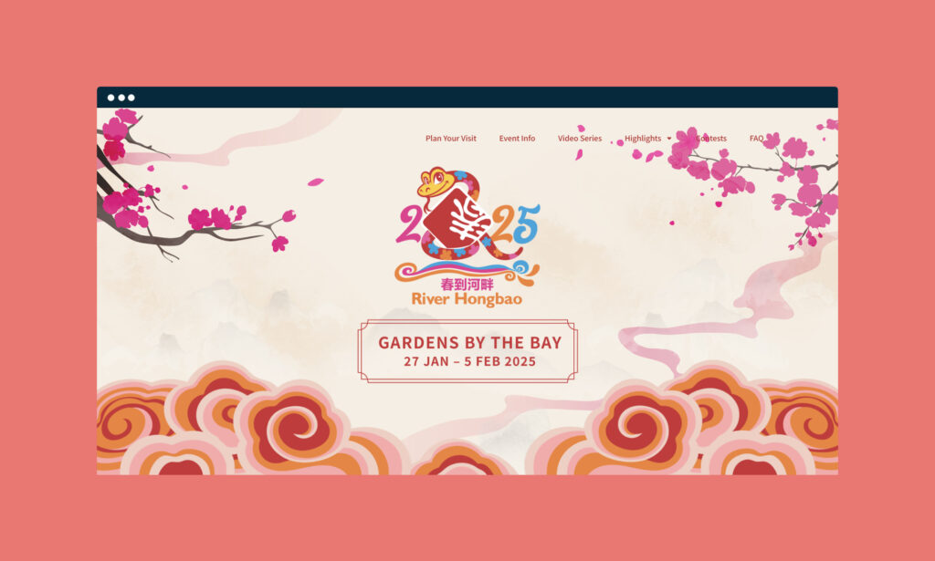
For instance, the Richmond Sunflower Festival uses vibrant colors and compelling photography to create an immediate emotional connection, capturing visitor interest before any text is read. Research indicates that visual storytelling has a significant impact on user engagement and recall.
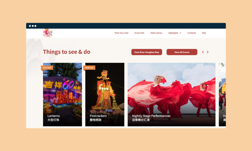
The Creative Retail Awards demonstrate the power of dynamic content through mixed-media layouts, including videos and image sliders. This approach aligns with studies indicating that motion and interactive elements keep visitors engaged longer and encourage deeper exploration of site content.
At the Digital Art Fair, user interface design prioritises intuitive navigation through floating cards and interactive features. Research highlights that these elements improve visitor interaction and time spent on the site, making even complex, tech-heavy content more accessible.
Inman Connect NY builds trust by prominently displaying testimonials and social proof, which psychological studies confirm increases credibility and drives registrations. The site also utilises countdown timers and bold calls to action to create a sense of urgency, a proven technique that boosts early sign-ups and conversions.
Together, these examples demonstrate how thoughtfully designed event websites strike a balance between aesthetics, interactivity, and social proof, informed by user behaviour research, to maximise attendee interest and participation.
✅ Festival and entertainment website inspirations
Event branding comes alive at All Together Now, where every section aligns with the festival’s tone and audience preferences.
The site doesn’t just inform – it mirrors the vibe the audience craves.
Oktoberfest Atlanta uses a one-page format where each scroll feels seamless.
Everything is within reach: schedule, venue map, and ticket links flow naturally like a guided story.
Fun City Manchester combines hover effects and large-font titles for an energetic pop-culture flair.
It makes interactions feel more enjoyable rather than functional, thereby boosting dwell time.
The Splore Festival leans into full-bleed visuals and anchored menus.
This creates a more immersive feel, where every movement gives clarity without losing aesthetics.
✅ Business and tech event websites
CES Digital Health gives updates a central role through video features and timely blogs.
The interface is designed to support professionals with accessible data and fast-loading tools. Outreach Unleash embraces simplicity with minimal colour and calm scroll animations. It guides the user through sessions and sponsors without a noisy layout.
For Think Chicago, the platform is guided by student usability. Navigation is intuitive, with logical clusters and digestible headlines meant for clarity over spectacle.
Women Startup Competition builds trust instantly through structured CTAs and a transparent schedule.
It saves visitors from excessive clicks, instead pointing directly to the event’s needs and next steps.
Key Features That Drive Engagement
Must-have elements for effective websites
Smart event websites provide users with what they need promptly.
Personalised dashboards display attendees’ own schedules and speaker preferences, making even large events feel more manageable.
Built-in maps, FAQs, and quick sponsorship blurbs all work together to reduce hesitation. Visitors know where they’re going, what’s available, and what to expect before they even arrive. Live chat options and downloadable media ensure that support remains readily available.
These tools give convenience a front-row seat, especially as visitors edge towards bookings.
Factors that improve usability
A simple, responsive layout is non-negotiable. Whether someone’s browsing from the MRT or at home, the site must adjust and run smoothly.
We always maintain consistent branding – fonts, colours, structure – for a frictionless browsing experience. This builds user confidence and assists with memory recall. Inclusive design stays a priority across our builds.
From colour contrast to scalable text sizes, every element needs to serve all user types, including those with assistive tools.
Creative Design Elements in Event Sites
Visual design techniques and tools
We love using illustrations combined with brand colour palettes to develop consistent impressions.
Every visual should strengthen the mood or message of the event itself. For high-energy shows, stronger hues and animated icons hint at liveliness. For formal summits, cooler tones and structured typography guide the overall voice.
Well-chosen fonts for headers keep eyes moving down the page, lifting the message. Every design tool adds purpose – not just decoration.
Layout formats and interactivity layers
We often include scroll-based reveals that make content feel more interactive without needing clicks.
Hover tabs offer previews, saving time and sparking curiosity along the way. Subtle movements, such as branded loaders or video backdrops, signal life on the page. This adds personality and keeps the browsing experience dynamic, not flat.
Whether it’s a single-page walk-through or a multi-page site with sections, the layout must fit the content type.
We always pick formats that prioritise readability and action paths.
Registration and Ticketing Page Optimisation
Structure of successful event registration flows
Visitors need a straightforward and stress-free ticketing system.
We design step-based flows that guide users from interest to completed purchase in the fewest clicks possible.
Secured forms and integrated payment options help remove second thoughts. We prefer placing cards upfront so users know the costs early and can make informed decisions confidently.
Timers or limited batch offers naturally push urgency. Not only do they help with conversions, but they also mirror the exclusivity of live gatherings.
Enhancing Content and Communication
Key supporting content for conversions
Blogs and quick event stories help build anticipation before the big day. Short updates with photos or host shoutouts add depth to listings and fill out content gaps. Adding previous guests’ words or community quotes allows others to trust quicker.
These reviews provide credibility and emotional connection – two key components of decision-making.
Where livestreams happen, adding feature boxes or third-party availability helps viewers stay engaged. Social sharing enables users to spread the word on the go, increasing reach without incurring additional expenses.
Advanced Tools & Future Trends
Innovative features for modern events
We’ve worked on sites that sync with apps, so event schedules update in real-time. This helps organisers send alerts, live amend sessions or send push notifications. Facial-recognition tools and GDPR-safe check-ins make welcome processes smoother.
Everything builds towards a thoughtful, guest-first approach that feels secure but seamless.
Virtual venue tours or walkthroughs allow a preview without pressure. It’s beneficial for hybrid events or when users want reassurance from behind a screen.
Planning & Strategy For Event Websites
Preparation tips for web execution
We begin our planning by establishing a clear sitemap that aligns with the event’s goal, not the trend. That means priorities like speaker sections, media pages, or partner listings take shape in wireframes first.
Using WordPress CMS fitted with Elementor gives our team fast flexibility. Clients can manage their own updates later without needing to learn complex coding.
And if a site needs help beyond launch, we offer maintenance plans that take care of future upgrades. We aim to be a reliable long-term partner – not just a one-time provider.
Design to Engage or Risk Being Forgotten
Your event website is more than an information hub; it serves as the gateway to building excitement, driving attendance, and delivering value before the event begins. A well-designed site helps visitors easily find essential details, register smoothly, and feel connected to the experience you offer.
In a competitive environment, successful event websites use straightforward navigation, engaging visuals, and seamless functionality to convert visitors into attendees and advocates. Focusing on user experience and purposeful design enhances registrations and reflects the professionalism and energy of your event.
At Singapore Best Web Design, we work closely with you to create event websites tailored to your specific goals and target audience. Together, we ensure your digital presence inspires interest, encourages action, and sets the foundation for a truly memorable event.
Frequently Asked Questions
What defines a great event website?
Clean layout, fast load time, clear CTAs, and strong visuals tied to event purpose.
What types of event site formats work best?
Single-page for quick events; multi-page formats for larger conferences or multi-day events.
How should speakers and content be shown?
Dedicated speaker cards with photos, topics, and timings help audiences filter and select easily.
What trends are coming in 2025?
Expect to see real-time maps, immersive video content, voice search, and QR-triggered microinteractions rising fast.